
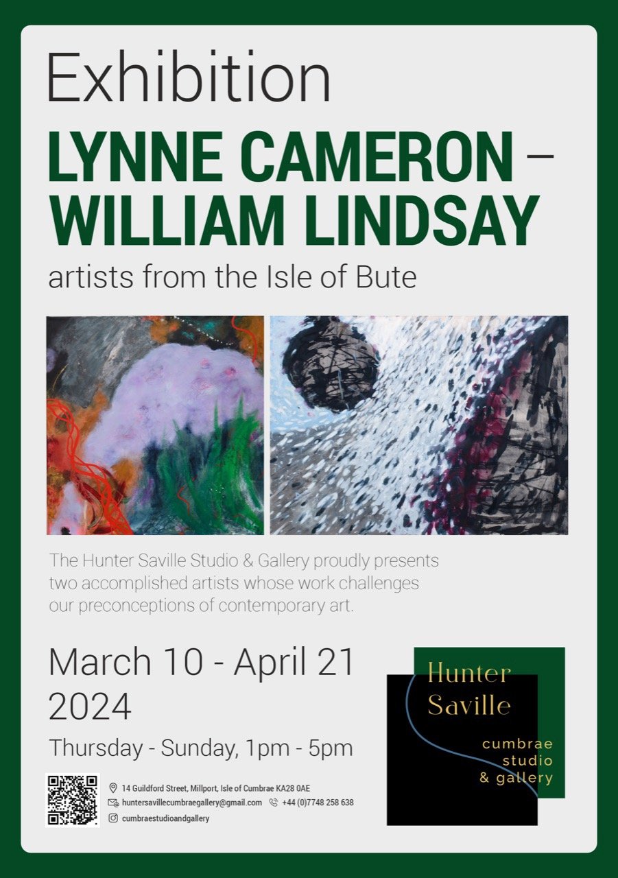
Cumbrae Gallery
Artist talk, 10 March 2024
Lynne Cameron
I paint in my house on the wilder west side of the Isle of Bute, often working under the howl of the west wind. Colour is the driving force in my work.
attending to paintings
I want my paintings to encourage the viewer’s eyes in journeys of exploration in the paint landscape – to move around, to linger, to investigate how colours come together or move apart. This ‘deep looking’, by the artist and by the viewer, is a kind of mindfulness, an attending, and lies at the heart of empathy. I want my paintings to draw the viewer in and to offer a landscape to attend to.
I don’t paint stories – I paint to disrupt stories
My painting is abstract, in that it does not try to represent objects in the real world. As a viewer, you may find a story springing up in your imagination as you look at a painting. I’d say, notice that story, hold it in mind, and look some more. Notice the layers that hide, reveal, disrupt. Look for the secret dimension in the painting. Find other possible stories. As you try to hold on to all of them, they will crack and dissolve and fall. Enjoy the story-disrupting.
colour
I love the possibilities of acrylic paint for creating colour on paper and canvas. It can be used thick and gloopy, and thin and runny, and anywhere in between. It can be made to drip and run across the surface. Wiped off when half-dry, it leaves echoes of colour and form.
Acrylic allows colour to be placed next to colour, on top of colour, allowed to show through. I use a minimal ‘Slade palette’- two each of reds, yellows, blues, Burnt Umber and Titanium White. I have a few tubes of important additional colours: ‘my’ indigo, turquoise, and a fluorescent pink. All other colours are mixed, including black which I mix from indigo and umber.
My signature colours are indigo, fluorescent pink, and scarlet. Indigo suits the melancholic west coast of Scotland – the sea is often a shade of indigo, the shadows in the hills, the sky on a wet day. Pink is joy. And passionate scarlet often serves my rage at what is happening in the world. You will find these soul colours in most of my paintings.
surface
Paint does not simply lie on the surface. Rather, the surface of paper or canvas grips the paint, holds on to it, sometimes shuns it. The heavy watercolour paper I use has a surface texture from its production process. Canvas is primed with gesso, which can be left textured or smoothed.
In the series ‘Other People’ (An occupation of the body, Only this moment, Poetry begins ), I began with writing – a poem or extract from my journals or a book – on thin paper that was torn into strips and then into words. Words were selected randomly and glued on to the large sheet of paper, creating a textured surface with words that could be covered or left visible.
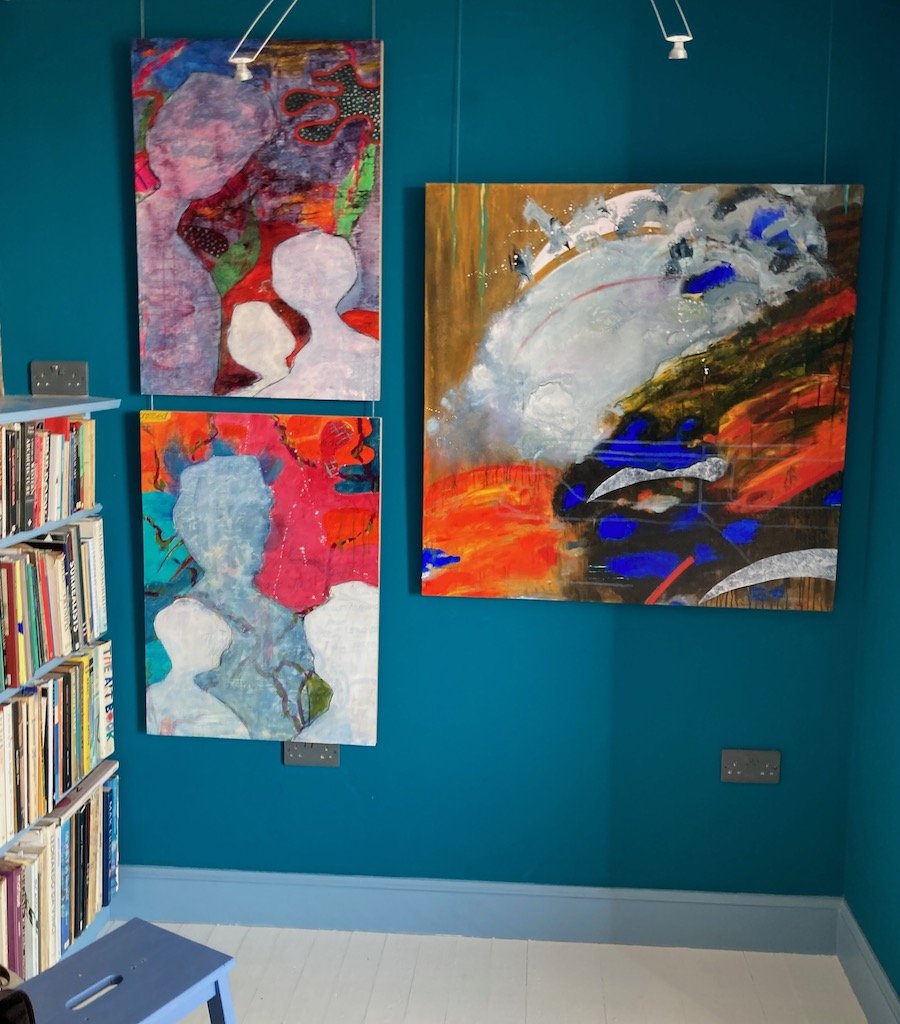
Left: Only this moment, Poetry begins Right: Built on risk and resilience
a dance of intuition and intention
My paintings result from an interaction of intuition and intention. Intuition is, for me, the quiet inner voice that tells me the next step, quite precisely and unambiguously. In contrast, intention is the result of analytic and rational thought that tries to find the best way given the circumstances – it has a goal and produces deliberate action towards the goal.
Intuition knows the next step. After that, the landscape of possibilities opens wide again and the path, which we can only see looking back, may turn unexpectedly
I spent time finding out about ‘intuitive painting’ because I felt that my inner voice had been too well muted by years of academic study, mathematics and then linguistics. Californian expressive arts therapy was a wild cure, producing bold colourful paintings that spoke of my personal agonies and delights. In this experience, I found ways of starting from colour; of being in dialogue with an emerging painting; of finishing. I also found words leaping up and turning themselves into poetry. It was, and is, exhilarating.
Thank You Letters
I often paint intuitively and let intention in towards the end. I allow the last act of painting to be danced deliberately, to pull together what had happened intuitively, to make intentional visual sense. The small Thank You Letter paintings are an example. The first layer is a handwritten thank you letter to someone or something important in my life, good or bad. The next layer is an intuitive response using colour spread with my fingers. The final layers work from the colour and the words to create a composition that ‘works’.
Sometimes a tiny portion of an intuitive painting is used as the starting point for a large canvas painted intentionally (e.g. Last Year) – as if a tiny sequence from Isadora Duncan were choregraphed for the opera house stage.
I continue to explore how intuition and intention can dance together.

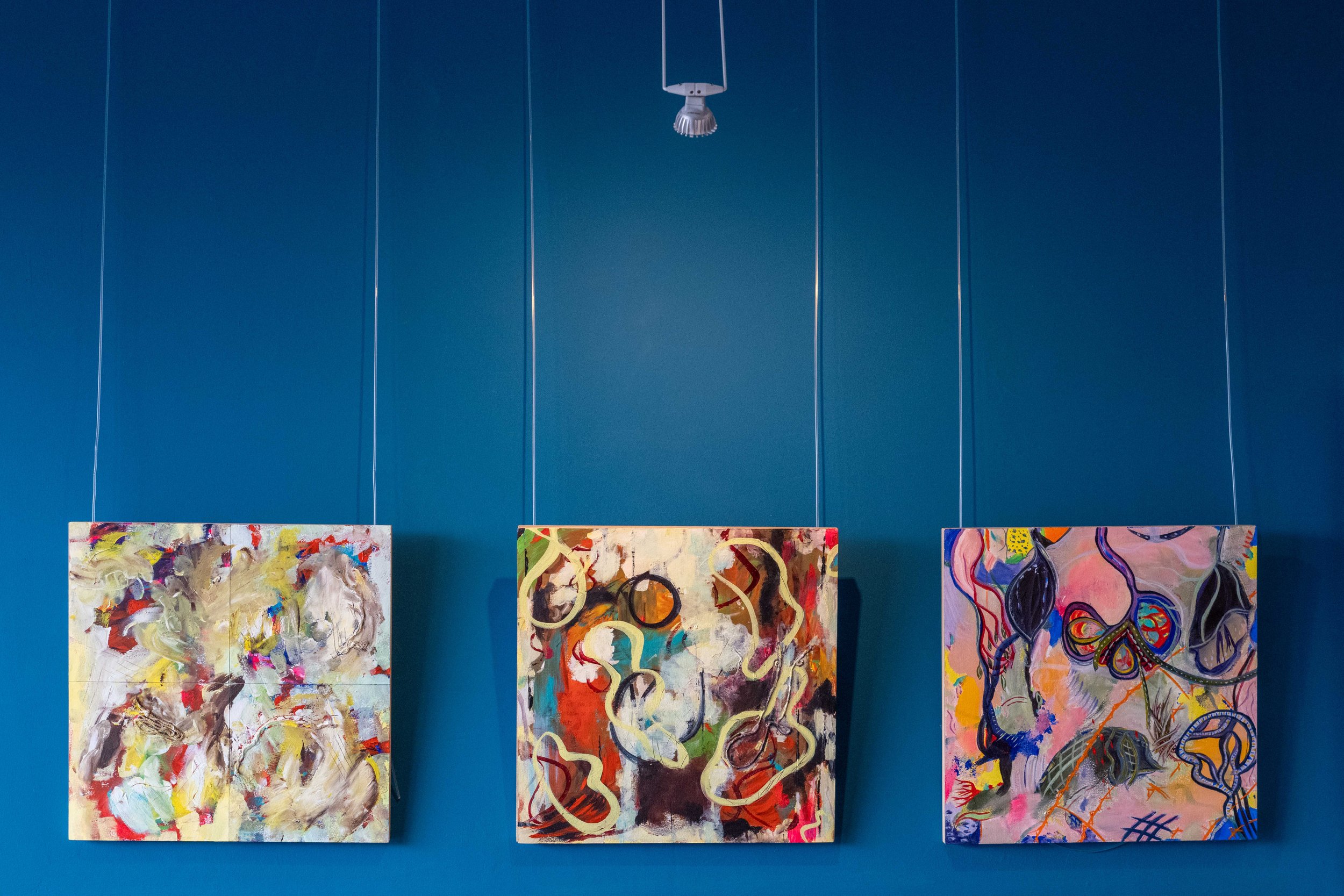
Too many ferries (left); Last Year (right)
the world
My paintings are abstract but they connect into the world as I live it. Too many ferries relates to a conversation with my older son, who lives in New Zealand, as we stood looking out into the Cook Strait that separates North and South Islands. How strange, we agreed, that only two ferry companies cross that water when so many people must want to cross. Back in Bute, maps in the museum from the early 20th century show the island like a hedgehog, with ferry routes in all directions, to Arran, to Cumbrae, to Tighnabruaich, to the mainland.
Built on risk and resilience (above) reflects my complicated life, carrying memories of still visible earthquake damage in Christchurch, New Zealand back to Bute and painting under its huge sky.
I paint ~
a trajectory of passing concerns
Lynne Cameron
(from the book I paint ~ available to buy here)
A collection of painting~poem artworks.
A refusal to compromise.
A fierce examination of a woman’s life.
A dynamics of contingency and response, disruption and contemplation.
The artworks in this collection record a practice that shifted into a new place over a short, intense period of time. These paintings~poems, with themes of loving and loss, sexuality and power, joy and shame, reveal an artist who is no longer the ‘nice girl’ who tried to please. She now shouts with urgency and determination. She screams out of the vast solitude of a woman alone, out of the great solace and opportunity of this stage in her life.
The creation of the collection began with learning intuitive painting, learning how to paint from inside oneself, to accept whatever arrives. Seeking visual images from outside of the self was replaced by listening, allowing the internal voice to become visual, and then textual.

An important moment for the work was the arrival of Scarlet, who entered the paintings as a female figure with orange-red hair curling down her back, symbolising the sexual and the sexualised.
Then Berlin: an artist residency; studio space; time to paint and talk; films; people, and thoughtful sharing of the work. Discussions of phenomenology, Gestalt theory, and a revisiting of existentialism. Being in the city and alone in her inner space. Silence~noise.
Outside the studio, autumn 2015 brought migration across Europe, and the next summer, the Brexit vote - social change shining a searchlight across morally-confused skies. Cameron’s horror of violence haunts some of the paintings, perhaps inherited from the post-war silences and shame that were background to a happy British childhood, reignited in Berlin by the city’s layers of history, by cinematic experiences, and by contemporary conflicts.
The residency allowed experiment and reflection in high-ceilinged solitude, and richness in company. Painting and writing happened in a frenzy of ideas and colour. Intuitive painting, assimilated into existing practice, became ‘dynamic painting’ as method and materials crystallised. The painting~poem artworks emerged as a series of sharp glimpses into the lived experience of a contemporary woman.
The tilde sign ~ is appropriated here to indicate the indefinable, and thus undefined, connection between painting and poem that includes relations of complementarity/approximation/congruence/being of similar order. The two parts, held in their tilde relationship, form the artwork.
Cameron’s use of the tilde has its roots in her undergraduate studies in mathematics, where it connects two ‘expressions’ in a binary relation. Two functions connected with a tilde are, at their limit, equivalent. In geometry, tilde expresses congruence. In logic, it signals negation: ~P is ‘not P’, all that is not P; the complement of P rather than its opposite. In physics and astronomy, it indicates that two expressions are of the same order of magnitude. Far from mathematics, medieval scribes used tilde signs in manuscripts to mark an omission, of letters so obvious that the reader could supply what was missing and the scribe could save a little vellum and ink.
In her academic research, Cameron uses the tilde sign to indicate the connection of two disparate notions: in a metaphor (M is T~V), and to highlight dyspathy as the complementary negation of empathy, at play in all of us when we look at the Other.
The process of making these tilde artworks begins with the artist standing in front of thick watercolour paper taped to a board on the easel. She sends her mind deep inside herself to find the colour that wants to be on the paper. The paint is squeezed on to palette, mixed if necessary. A brush is selected. A brushstroke of colour, a gesture, begins the painting.

As soon as the first stroke is placed on the paper, a conversation has begun – between white paper and colour, mark and space, artist and painting. The conversation continues through listening, asking, responding. At some point, a different colour is requested, perhaps a change of brush. Mark responds to mark. The paper is covered.
A painting may take several days to complete, each day adding a new layer. A readable form may emerge or a distinct feeling. The brush may suggest a tree, or an unravelling ribbon, or a road that seems to climb a mountain. The artist chooses then to work with this idea, or to ignore it.
At some point, a pause.
Then the journal and a pen with smooth running ink.
“What does the painting say?”
Words join words, in an intuitive unfolding of similar order to the painting process. The textual poetic fragments often refer to the colours and gestures of the painting. When written down between layers of painting, they can influence how the artist sees the painting. They record while also affecting.
And finally comes a stage of formalising and integrating, as the painting is revisited and completed, as words are made poem. The finished painting~poem artwork emerges from one continuous process, the different forms offering congruent expressions of affect, complementing while also interacting.
The collection was compiled from eighteen months of studio work in response to passing concerns and changing issues. Like a current underneath runs a continuing concern with the absence of women’s voices – even now, even here.

(from the book I paint ~ available to buy in the shop)
~
Our flying shapes the sky
Artist talk by Lynne Cameron
6 July 2017 Cinepoetics, Freie Universität Berlin
This exhibition is a thank you to Cinepoetics for the last two years – for the rich environment, for the ideas, for the friendships, for the provocations. My Fellowship and Residency have given me time, and wonderful spaces to reflect, to experiment, to work.
What you see exhibited is a small fraction of the paper and canvas I have covered in this time. A metonym for the doing, thinking, making that has been inspired by being here. The work shown is mostly new, with some that may be familiar from earlier exhibitions. Some of what is here is completed. Some of it is very much ‘in progress’ and exploratory. Endings, it seems are also beginnings.
Each collection on display is a set of responses through mark-making / painting / visual images to being ‘resident’ – in Berlin, in the apartment, in the studios at Cinepoetics. As a painter, I find my work responsive in a very experiential, non-verbal and even non-conscious way, to changing light and the colours of the seasons – the greens of early spring out of the studio window; the vivid orange-gold of autumn lining the roads I drive along. As a painter, and as a cinema-goer and as a woman, I responded to the films we watched. As a painter, an academic and a woman, I responded both visually and intellectually to people, to interactions participated in, and to ideas I’ve met here. The responses have been made in sketchbooks, journals, with photos on iphone, on paper, on canvas. They inform and influence each other. They afford possibilities to each other and connect with work done before coming here. They lead to artworks.
Before I go into more detail about the work, I revisit key concepts that lie behind it.
Poiesis, poetics and the presence of absence
At the start, it wasn’t entirely clear what an artist in residence, a painter, might offer to advanced film studies. Before leaving the UK, I wrote a proposal that left things rather open but which suggested that poiesis, i.e. bringing into being something that did not exist before, might serve as a connection between my work and the work of Cinepoetics. – The particular approach to understanding film viewing that underpins Cinepoetics sees the viewing experience be a kind of poiesis. And during my residency I have tried to open up the poiesis of making and viewing painting to colleagues.
For me, making art is also a poetic act, and so I want to include a few words on ‘the poetic’ and to add the idea of the poetic to poiesis. The poetic for me concerns understanding that lies beyond words. Poetic making is a bringing into being of a meaning, an experience or affect that cannot be fixed or finalised. Importantly for those of us dwell in a world of words, this meaning / experience / affect cannot be adequately expressed or communicated through verbal language. It somehow lives and arises in the spaces between words.
We had a great example of the poetic in a recent Studio Interlude. Looking at a colleague’s abstract painting, someone said, “I can see birds in a sky but I couldn’t show you where there is a bird”. She was trying to verbalise the feeling that the painting created for her, out of colour, form, texture.
This poetic potential is why I love painting and making art – the making is an experience that goes beyond words, and sharing the work is an offer to viewers of the work of affordances for poetic meaning / experience / affect.
As an aside re my old love, metaphor I have this to say: Metaphor is the trope that does the poetic for a living, par excellence. And that’s why people sometimes conflate metaphorising with poetic thinking. In contrast, I require these to be distinct, and overlapping.
Metaphor comes to act as emblem for poetic thinking, to serve metonymically, as synecdoche, but metaphor and poetic thinking are not the same thing, and not always the same kind of thing. Unlike poetic thinking, metaphorising happens in the most everyday or prosaic thinking, as Lakoff and Johnson reminded us back in 1980 with examples such as career ladders. What happened next was another process of metonymy; after broadening the scope of metaphor, the poetic was again conflated with metaphorising, leaving us with a broadened notion of the poetic (all our thinking is therefore poetic). In my opinion as an artist, this has been an unhelpful broadening. I want to preserve some sense of ‘poetic’ as aesthetically appealing. I judge this sense to be inexpressible and thus impossible to define. Perhaps its inexpressible complexity is due to it being at the same time experiential and embodied, individual and socially constructed.
The notion of the poetic as unfinalizable, experienced and inexpressible, felt and unsayable, leads me to think in terms of spaces between, of alterity or otherness. In painting, I long ago discovered the metaphoric potential of using negative space in composition. I linked it to the watery variant of ‘va’ which is Samoan word to describe the ocean space between land masses, knowing which is vital for surviving on a Pacific archipelago.
With a chance rediscovery here in Berlin of existentialism, of de Beauvoir and Sartre, I came across Sartre’s idea of the presence of absence … and found this a beautiful, rich metaphor for the poetic as inexpressible meaning / experience / affect, induced in the space between colours on a canvas, between artist and painting, between painting and viewer. This is not a space of incomprehension but a space of extra meaning / experience / affect, of mysterious unsayable meaning / experience / affect that somehow matters to us. Adding this notion of the poetic to poeisis, we can see that making and viewing artworks, and films requires us to dispense with the goal of clarity and understanding, of determining a ‘meaning’ or even an interpretation. We can value the presence of its absence.
Lately I have resurrected the use of the tilde symbol ~ in my writing about art. I’ve long used it in writing about metaphorising as Topic ~ Vehicle unfinalizable, experienced and inexpressible, felt and unsayable. Now I have recruited it to express a wider sense of a more open ‘holding’ of the multiple and contrasting, without verbalising explicit connections, without trying to find a resolution. The tilde ~ indicates a suspending of the intention to speak a resolution into existence.
Now as I give you a ‘tour’ of the work in the exhibition, you will see how these ideas inform the work.
Studio Interludes
One of the delights of my stay has been the Studio Interludes. I wrote this into my proposal before coming. I had no idea what would happen. I started with the simple plan of inviting colleagues into my studio every week or so to see what I was doing, to talk about it and to have a go at some art-making.
It turned into lively collaborative work and some exciting individual productions. We became a group, contributed activities to the workshops, encountered artists and their styles, tried painting, collaging, and put on several small exhibitions.
Over the final six weeks, a small group have been documenting what we did and producing a collective response to the experience of Studio Interludes.
Upstairs in my studio, you can see the outcome and some of the work, and talk to participants. There’s a chance to look again at the large works we made together. Do visit them – you may be surprised by what has been achieved.
Conversations with films
My sketchbook and black pen goes everywhere with me. Into the dark too.
In the first year, we watched films and film clips in colloquia and workshops, analysing metaphors and developing the idea of ‘cinematic metaphor’ that will have an important impact on metaphor studies through the book that’s being written now. Then, with the wonderful new screening room, came film analytical colloquia. A focus away from metaphor and into affect, genre, politics and poetics.
Screenings forced me to write notes and draw striking images in the dark, illuminated only by light from the screen. The pages often looked a mess rather than poetic. But I began to notice how overlapping writing made interesting shapes and how some of rapid lines and marks I made as notes from the film were interesting, in themselves and in relation to words.
I downloaded film stills and explored cutting out and collaging. I experimented too with responding to the early films with paint on paper, and with animation effects in powerpoint, where my technical expertise acquired as an academic could come into conversation with art-making. Then came the offer of music to add a sound track. The exhibition launches two short movies with newly composed music by Dr Eileen Rositzka: Notes in the Dark and Conversations with Jezebel.
Conversations with theory
In lectures, colloquia, workshops, meetings, jours fixes, there is light enough to see my sketchbook pages. Not always metaphorical light enough for me to make sense – as a scholar from social sciences meeting philosophy and humanities head-on. Sometimes it has felt like a pummelling, sometimes like being in a fog, and usually interesting. I get glimpses of insight, blinking lights that signal a connection with my work or reading. These experiences took shape on the page as I wrote down concepts to remember, names to search out, and as I doodled around the words while listening.
Again these pages were not initially intended as artworks. The poetic possibilities emerged over time. In acts of downward causation, I began to notice how I filled the page, doing more of what looked good. Some days nothing happened. There seemed to be a particularly rich period for these pages in the summer and autumn of 2016.
Visiting bookshops, I noticed a resonance (a connection that is a reminding, not analogical, metaphorical) with a recent craze for adult colouring books and saw a sudden potential. So today I am pleased to offer you a kind of souvenir booklet that you can colour in at your leisure.
Pushing the boundaries: a series of dynamic paintings
While in Berlin, I developed a style/technique of painting that I call ‘dynamic painting’. I had taken a course in intuitive painting, online from California, as I attempted to hear my intuition after years of ignoring it in order to be a scholar… It has been the biggest shift for me in my time here- taking this seriously as a method and taking the artworks that emerge seriously too. Around the end of 2016, I noticed that I had produced a series of large paintings on paper that echo the sketchbook doodles. There was no initial concept for these; as dynamic paintings, they begin from colour and move into a dialogue of mark-making. Post-hoc they seem to echo the concept of, sometimes difficult, ‘conversations with ideas’. This collection exemplifies what I call the emergent poetic.
Recent paintings on paper and on canvas
see the catalogue
Launching the book I paint~
I am delighted to be able to share with you my latest publication and artwork, and an important ‘bringing into being’ of my residency. It is very different from my books on metaphor analysis, although perhaps follows on, in some way, from the poetic final chapter of Metaphor and Reconciliation.
The poiesis of the book originates in the process of dynamic painting described above. And addresses a long term issue of how words might combine with images in my art-making. I had tried making art out of my empathy research, and from spoken interview data. Eventually I went abstract, started from colour, and let the paintings speak for themselves. But while making dynamic paintings, I discovered words and phrases arising in my head/body. Some wanted to be included on the paper. Others were written into a painting journal.
As a senior woman academic, and as a woman talking with other women, I find myself often asking women why they are hiding their voices and thoughts, choosing to remain silent. In a very concrete way (and as a metaphor), I notice that we often keep the art we make that has most meaning for us under the bed or shut in a cupboard. I have done that. And I noticed that I was doing it again – the ‘poems’ stayed in the journal, unspoken. I determined to bring them into the light. Very slowly, I started reading them, typing them, speaking them aloud. It was hard to do because these are quite personal responses. But working as an artist pushes us to draw deep on what matters to us, to be vulnerable.
The work was affected by my re-visiting of existentialist ideas during my stay here. Simone de Beauvoir’s The Second Sex was a revelation, and a challenge. She seemed to shine a searchlight on my history, on what was influencing my becoming a woman in post-war Britain, and that searchlight still illuminates our becoming as women. She writes about the physical limitations, fears and modesty that we are taught from a young age and that can hold us back from achievement. Her challenge became a goading into action to put this book together.
A bout six months before I came to Berlin, a woman appeared in the paintings. Her name was Scarlet and her appearance in paintings speaks to Simone’s ideas. I leave you to experience the conversations of Scarlet and Simone, of paintings and poems
Eventually I collected together 47 painting~poem artworks and put them together into this book, with the help of Symark design studio.
The book is on sale here.
Conclusion
The title of the exhibition- Our flying shapes the sky - comes from one of the paintings in the book. It encapsulates poetic thinking with echoes of meaning, hints of complex dynamic systems in interaction, of the deep joy of making art. I am so happy and grateful to have spent this time with Cinepoetics. Enjoy the show!
----------------------------------------
essay from the living impulse Exhibition catalogue

Countenancing Beauty: The paintings of Lynne Cameron
written by Steve Wright, curator of the exhibition 'The Living Impulse', London, June 2014.
There are two kinds of painter: those who work out a painting in advance; and those who discover what it’s going to be through making it. Lynne Cameron is one of the latter, her approach both purposeful and flexible. There are clear ideas, interests and intentions, informed by Cameron’s academic research into empathy and metaphor; there is also paint. As a painter, I’m most interested in how these works have been made and how we should look at them.
‘The Living Impulse’ brings together different kinds of painting that represent stages in Cameron’s recent development; like all really interesting artists, she doesn’t stand still. Indeed, it’s by changing the nature of our artworks that artists find out what we’re really interested in, because something always stays the same, however divergent the various avenues we explore.
One unifying element is Cameron’s colour. Here is an artist unafraid of colour, though increasingly exploring its subtleties. Her palette derives from the places and people she has encountered and is firmly rooted in the present by her use of fluorescent acrylic paint. She is at her best when her colours have been liberated from their original context and can interact with each other without having to describe a landscape or object. In the series A Wonder World for Enid, the same intense hues of her abstract paintings are contained and controlled by subsequent layers of ethereal greys that soften or conceal the underpainting. To the painter, grey can be the most beautiful of colours.
The enquiring, intelligent nature of these works marks them out as ‘serious’ paintings, although Cameron’s willingness to allow them to be beautiful goes against the grain of contemporary art theory and education, which favour the cerebral over the aesthetic. But, as Cameron says, beauty is anything but easy to achieve. It requires an understanding of the medium; a sensitivity to nuances of colour and surface texture, brushstroke and drip. Moreover, the painter must create something original that won’t immediately strike the well-informed viewer as similar to something already seen. This is where the narratives underlying these paintings are so important: they lead the artist to do specific things with particular colours, in a certain format that become something new. There are influences here, including Emil Nolde and Hans Hofmann – but they inform rather than dictate the work, whose nature remains experimental and personal.
All of these works derive from ideas about communication and situations where it has broken down, whether from inter-tribal conflict in Kenya or the debilitating effects of dementia. Looking at Lynne Cameron’s paintings, it is important to remember that painting, though a means of communication is non-verbal. To appreciate them, look closely at their colours and surfaces, at the spaces in-between forms and flowers, at the glimpses of submerged layers, asking how it was achieved and what it might mean – but don’t look for clear answers. As Edward Hopper observed, “If you could say it in words, there would be no reason to paint.”
Steve Wright www.stevewrightart.com